 |
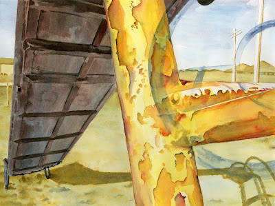
| Mid-Twentieth Century American Playground 5 Matthew D. Hughes Gouache on Bristol 9 1/2 x 12 1/2 inches 2011 |
For this painting, the assignment was to use Itten's principle of the contrast of saturation. In this color contrast, the point is to create areas of emphasis through using differing degrees of saturation. A color in its pure hue can be desaturated through mixing it with its compliment or by tinting (adding white), shading (adding black), or toning (adding black and white). By juxtaposing areas of saturated color (pure hue) with areas of desaturated color, contrasts are created. Sometimes, art work that is considered a contrast of saturation may have minimal areas of fully saturated color. These works often appear much more muted and nuanced.
No comments:
Post a Comment