Monday, September 17, 2012

Six Painting Series for Color Theory: Part 6

Matthew D. Hughes
Mid-Twentieth Century American Playground 6
Matthew D. Hughes
Gouache on Bristol
9 1/2 x 12 1/2 inches
2011
Here it is, the final painting in my Mid-Twentieth Century American Playground series. This time around, I decided to try and work looser and more painterly than I normally work. If you've looked at my drawings, I normally work in a very controlled manner. Looking back on this painting, it is still quite controlled, yet it is a departure from my normal endeavors to achieve extreme realism. Much of the reason I chose to work so loosely was due to the time constraint I had on this work. If memory serves, I think I had about a day to get this one done. I think I did it in about 5 hours. Despite the time crunch and being the fastest of the six paintings I completed, this one is probably my favorite.


I believe the reason I like this one so much is that it has an interesting composition. A close up of the rungs of a slide ladder, there is a great sense of depth on display. Although not deep space, the forced perspective gives the sense that you're actually looking down as you get ready to scale this ladder. Additionally, the progressive rhythm of the repetition of the rungs further enhances that illusion of depth.

Something else I just noticed while looking at this painting as I typed the above analysis is that the textile pattern on the rungs also further unifies the composition. Although it is not a pure, formal pattern due to the areas of corrosion and paint chippings, this is still a good example of a regular pattern that is repeated throughout the composition.

Upon first look, this painting appears to be a great example of a warm/cool color contrast. Reds and blues are typically used in that since. However, there is that small area of yellow. Even though yellow is a warm color, and could further be argued that this is about warm and cool, since it is used so sparingly it becomes more about the contrast of extension.

In the contrast of extension, a small amount of color is used to add an area of emphasis or create a focal point. Here, I used the yellow to further draw your eye down in the composition. The contrast of extension can also be applied by using objects. Consider a black and white photo of a small group of people talking close together while an unengaged man is standing off to the side. The lone person becomes an area of emphasis because he is not a part of the group. Although he is a person and thus a repetition of a "shape", since this guy is out of place be becomes the point of our focus because our minds wants him to be grouped with the other shapes that he is akin to. Our minds work the same way with color. In this painting, we expect the colors to all be reds and blues because these hues dominate the composition. However, since that yellow is so drastically different from the rest, it stands out.
Six Painting Series for Color Theory: Part 5

Matthew D. Hughes
Mid-Twentieth Century American Playground 5
Matthew D. Hughes
Gouache on Bristol
9 1/2 x 12 1/2 inches
2011
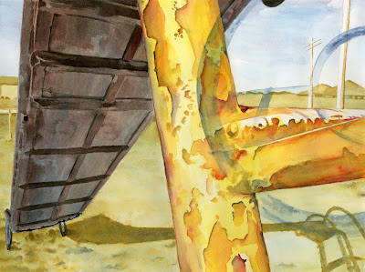
One of the wonderful things about the medium of gouache is its versatility. In this painting, I used gouache much like one would use watercolors. By laying down multiple layers of translucent washes, I was able to achieve some areas of nuanced color. Take the underside of the slide, for example. Here, I used cooler colors to show that this area is in shadow. By layering blue and red-violet washes, you can see both colors working together to imply the coolness of the shade while also conveying differences in the planes of the surface.

For this painting, the assignment was to use Itten's principle of the contrast of saturation. In this color contrast, the point is to create areas of emphasis through using differing degrees of saturation. A color in its pure hue can be desaturated through mixing it with its compliment or by tinting (adding white), shading (adding black), or toning (adding black and white). By juxtaposing areas of saturated color (pure hue) with areas of desaturated color, contrasts are created. Sometimes, art work that is considered a contrast of saturation may have minimal areas of fully saturated color. These works often appear much more muted and nuanced.

Back to the Future

Now that summer has ended and the fall semester has begun, I have had the time to look back on how neglected this blog has been. At this point in my school career, I am a Junior, but this blog has only gotten as far as mid-fall semester of my Sophomore year.

In the days and weeks ahead, I plan on making some updates here in order to get caught up to "real time". At that point, I intend to begin posting on a regular basis. These posts that begin after the "catch-up" will be less formal. That is, not every post will feature a finished work of my art. Instead, my goal is to show works in progress as well as thoughts and musings on art and life.

As always, I welcome your feedback on all previous and upcoming posts. Additionally, if you have any ideas of things you'd like to see me cover or explore, I'm open to suggestions. I'm completely new to this blogging thing, so all ideas are welcome. I look forward to sharing with you my journey as an artist and as a person.

Cheers!
Matt