Tuesday, July 31, 2012

Six Painting Series for Color Theory: Part 4

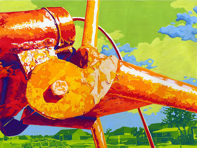
Mid-Twentieth Century American Playground 4
Matthew D. Hughes
Gouache on Bristol
9
1/2 x 12 1/2 inches
2011
This painting represents a stylistic turning point for my work.

During the 2011 Fall semester, I was taking an Art of Journaling class in addition to Color Theory. The Art of Journaling class was designed to develop one's skills at perceptually documenting experiences through sketching. Through this class, I discovered my love to work with hatching.

Hatching is a linear style of creating volume and value through the building up of parallel lines. Another style of linear modeling is cross-hatching where the lines are allowed to intersect. Similar to regular hatching is cross-contour hatching which also uses lines that run parallel to each other, but instead all the lines going the same direction, the line work follows the contours of the object they are describing. The regular, parallel hatching is the style which I have adopted for my own. Not only was hatching preferred by Renaissance artists for its ability to describe the volume of a subject rather than it's texture, but it is also a fast method to work with while sketching. This assignment required a linear application. Naturally, I gravitated to my new-found love of hatching.

This painting represents Johannes Itten's warm/cool color contrast. Compositions that are dominantly blue and red are typically warm/cool contrast. However, hues such as blue-green and red-orange can also demonstrate warm/cool contrast. The thing to remember about warm/cool contrast is that it must feel warm in some places and cool in other places. Warm areas will contain any of the hues from the warm side of the color wheel--yellow, yellow-orange, orange, red-orange, red, red-violet. Cool areas will contain any of the hues from the cool side of the color wheel--violet, blue-violet, blue, blue-green, green, yellow-green. This painting is a good example of warm/cool contrast because one can feel the heat of the areas that are hit by the direct light. Conversely, the areas that are in shadow actually feel cool, as if one can escape the heat by retreating to that shadow.

Six Painting Series from Color Theory: Part 3

MatthewDHughes
Mid-Twentieth Century American Playground 3
Matthew D. Hughes
Gouache on Bristol
9
1/2 x 12 1/2 inches
2011
Of the six paintings in the series, this is the one that took the longest. The reason for the it taking the longest should be self evident: pointillism. 

Yes, the required style for this assignment was pointillism. Although I personally like the optical effects that are achieved through the use of pointillism, this style is so tedious, monotonous, and time consuming that I have to question if the outcome is worth the  cost. The only reason I can see that would drive me to visit pointillism again in my artistic journey is if I were to come up with some completely original fantastic twist on the style that warranted re-exploration. Until that time comes, pointillism will continue to gather dust on my shelf of stylistic tools.

Ok, enough about pointillism. Let's talk color. For this composition, complementary color contrast was required. Johannes Itten's complementary contrast is probably the easiest to employ. This ease of use comes from the ability to choose any hue and then merely pair it with the hue that is directly opposite it on the color wheel. Therefore, Yellow-Green is paired with Red-Violet, Yellow with Violet, and Orange with Blue. As is the case in this painting, complementary contrast is not limited to the use of only two  complementary hues; there can be multiple complements in action.

Sunday, July 29, 2012

Six Painting Series from Color Theory: Part 2

MatthewDHughes
Mid-Twentieth Century American Playground 2
Matthew D. Hughes
Gouache on Bristol
9
1/2 x 12 1/2 inches
2011
The second entry into my Playground series is an abstraction of a spring found on a teeter totter. The cubist abstraction was a stylistic requirement of the assignment. Prior to this painting, I have never worked with cubism before; my style of choice is normally realism. Designing a composition incorporating cubist elements was actually quite enjoying. Working in a different style that is more about abstraction can actually be quite liberating. Instead of being so preoccupied with correct proportion, I was able to work more intuitively.

Johannes Itten's theory of color contrast employed in this painting is Light/Dark Contrast. Through tinting, shading, and toning, contrast in color is achieved. Although I have created a light/dark contrast in a monochromatic (only one color used) painting, light/dark contrast can also be achieved in a polychromatic (multiple colors) painting.

Saturday, July 28, 2012

Six Painting Series from Color Theory: Part 1


painting.gouache
Mid-Twentieth Century American Playground 1
Matthew D. Hughes
Gouache on Bristol
9
1/2 x 12 1/2 inches
2011


* Accepted into the Oklahoma Art Guild's Oklahoma Friendly art show.
Color is one of those subjects that one can learn all about in a short amount of time, yet it can take a lifetime to master its application.

In addition to creating the standard color wheels in class, we also had to paint a six-piece series to demonstrate our knowledge of Johannes Itten's color contrasts. The subject of these paintings was to be either a series of self-portraits or a series based on an object. Since I sometimes like to be different and push the boundaries of what my faculty will allow, I decided to view the term "object" in a  different light. I substituted the word "noun" for "object". Changing that term was liberating. Instead of being constrained to portray a singular object in different views and abstractions, I decided to use a singular object that is made up of other singular objects: a playground. This playground is close to my home and my son's favorite place to go play.

The assignment for this painting was to use Johannes Itten's Color Contrast of Hue. Contrast of Hue is when most of the colors in the composition are at spectral intensity (no desaturation through shading, tinting, toning, or mixing a color with its complement) which creates contrast. In addition to this required use of color, the style of the painting was required to be flat-match contrast. Therefore, volume had to be conveyed through areas of flat color instead of modeling.

Thursday, July 12, 2012

Anticipation

This will be the last piece I post from my freshman year. This, too, was drawn during the second semester.

For many reasons, this drawing holds a special place in my he[art]. Most notably, I created this drawing only a couple of weeks before my daughter was born. This assignment was to draw hands in an interesting and personal way. I could think of no better way than to depict my hand, along with my wife's and my son's hands, resting on the little bump in my wife's belly that would sound join our family.

As if that wasn't enough (which it is), this is the first piece of my work that was accepted into an art show. In the spring of 2012, Anticipation was chosen to be part of the 46th Annual National Drawing and Small Sculpture Show at Del Mar College in Corpus Christi, TX.

hands, drawing, charcoal, pregnant, family
Anticipation
Matthew D. Hughes
Charcoal on Rives BFK
22 x 30 inches
2011

Sunday, July 8, 2012

Wall Still Life

Wall Still Life
Matthew D. Hughes
Charcoal on Rives BFK
22 x 30 inches
Completed April 2011
Another drawing from the second semester of my freshman year. Although I have grown fond of this piece since its inception, I was, at first, disappointed with the subject matter.

The assignment was to draw from a still life that was setup on the wall. Each student had a different still life to work from. By the time I came into class, all the "cool" still lifes had been chosen -- cool being defined as containing skulls, leather, or reliefs. This was the best I had to choose from. However, looking at the composition now, I am quite pleased with the movement the objects create and how it leads the eye around the picture plane. Additionally, the repetition of the model railway ties and the repetition of the two hexagonal objects (I still have no clue what they were) serve to unify the composition in a way that I was unaware of upon beginning my drawing.

Self-Portrait: Revealed

rosary, watch
Self-Portrait: Revealed
Matthew D. Hughes
Pastel and Charcoal on Rives BFK
22 x 30 inches
Completed February 2011
Here is another first for me -- the first time I used pastels.

Drawn during the second semester of my freshman year, this portrait was a lot of fun because it wasn't a standard portrait. Instead of drawing from a mirror or a single photograph and depicting the subject front and center, the composition became more of a still life. The photos were layered upon each other so that the top two layers could be ripped away to reveal the images underneath.

At the time I was designing this composition, I was looking at the work of John Whalley. Much of his work that I was looking were still lifes of smaller objects against a flat background. The objects were often things he had found on the beach or elsewhere. Being greatly influenced by his compositions and his beautiful technique, I decided to incorporate some objects into this work since I was already working from something three-dimensional -- the torn edges folding back to create interesting overlapping elements.

The question I always get about this piece is, "why does the watch display a time of 2:30?"
The watch was a wedding gift from my wife. The time on the watch is the time we got married.

Self-Portrait

Self-Portrait
Matthew D. Hughes
Charcoal on Rives BFK
22 x 30 inches
Completed December 2010
This self-portrait is from the first semester of my freshman year of college. It was the first time that I worked extensively with charcoal. Although I was quite proud of this piece when it was finished, looking back at it after so long, I feel that several of the areas are somewhat flat. That may be due to the lighting.

When I decided to go back to school, I was unsure if I should really be an art major. I'm from the philosophy that there is always someone out there better than you. I still hold to that notion. However, through the encouragement of my instructors and the realization of my capabilities, I am beginning to cultivate a confidence in my work and the decisions I make while creating it. This piece is where that self-realization began.

Welcome

Thanks for visiting my new blog! As the title implies, this is a blog about art... my art. Therefore, this blog needs some art on the walls. For now, I'm not going to go into any long detailed information about myself and why I started a blog and so forth. For now, I'm just going to put up some art. Future posts will definitely be more narrative, and I look forward to sharing more about myself. Until then, enjoy the artwork.

At this time, I am going to post some of the works I have completed during my past two years at college to catch you up on where my work is currently.

As will always be the case, please feel free to leave any comments you may have. I'm not a god, therefore, I am not perfect. I realize this fact, so I am open to, and welcome any, constructive criticism. Again, thanks for visiting.

Cheers!